For Developers
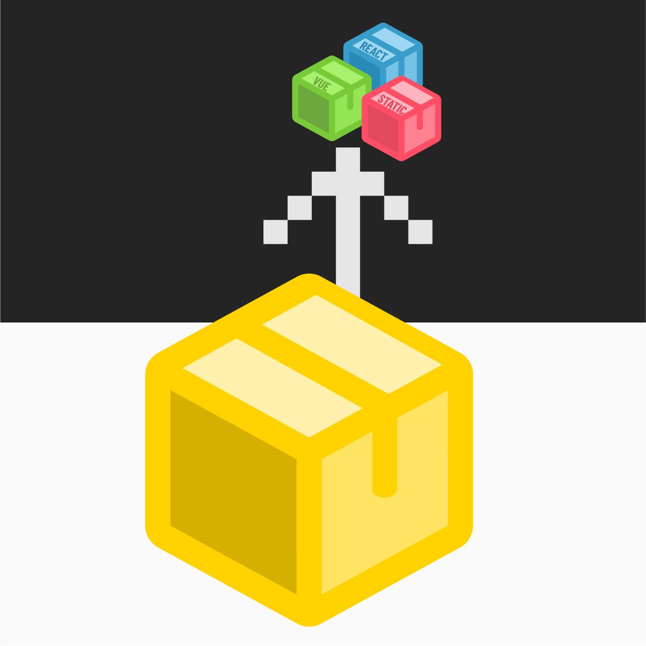
The UMD Design System is a collection of open-sourced packages for building branded University of Maryland interfaces. The system is platform-agnostic and works in any codebase — components can be added to a page in minutes via CDN with no build tools, or installed via npm for full tree-shaking and framework integration.
Where to Begin
The packages are maintained in a mono-repo hosted on GitHub. Each package can be added to your codebase via npm or referenced using a script tag with a CDN source — no build tools required for the CDN path.

Open Source Repository
The GitHub repository contains installation instructions, advanced use cases, codebase inspection, and collaboration options. It is open-sourced under MIT licensing and can be forked to suit any unique needs.
The repository organizes packages across three layers. The Foundation layer provides design tokens, SVG icons, and shared utility functions. The Infrastructure layer includes a static CSS styles library, a web component model, and an element builder API. The Application layer delivers ready-to-use web components with Shadow DOM encapsulation, foundational UI element builders, and dynamic content feeds for news, events, and more.
Package Installation
The component library is built in TypeScript and can be referenced via a CDN script tag for quick starts, or installed via npm for production applications. The CDN approach requires just two tags — one script for components and one stylesheet — and works in any plain HTML page with no build step. For detailed installation instructions and code examples, refer to the developer documentation.
The styles library ships as pre-compiled static CSS covering typography, layout utilities, spacing, and design tokens as CSS custom properties. For projects using a build pipeline, Tailwind integration is supported with additional documentation available here.
Package Implementation
On each component page, you'll find sections dedicated to use cases and best practices as well as code examples for HTML markup and variations.
The Foundation pages offer theme examples for grid, spacing, color, and typography.
In Templates, you can explore visual examples of structuring components with theme styles for layout, typography, and unique use cases.
The Playground lets you browse interactive component examples and copy ready-to-use code without any local setup.
ACCESSIBILITY TOOLS
WAVE generates false positives for color contrast issues based on the shadow DOM. Its current implementation does not inspect the layers within the shadow. We recommend using Lighthouse over WAVE.
Release Notes
Get the latest updates for UMD Design System releases.