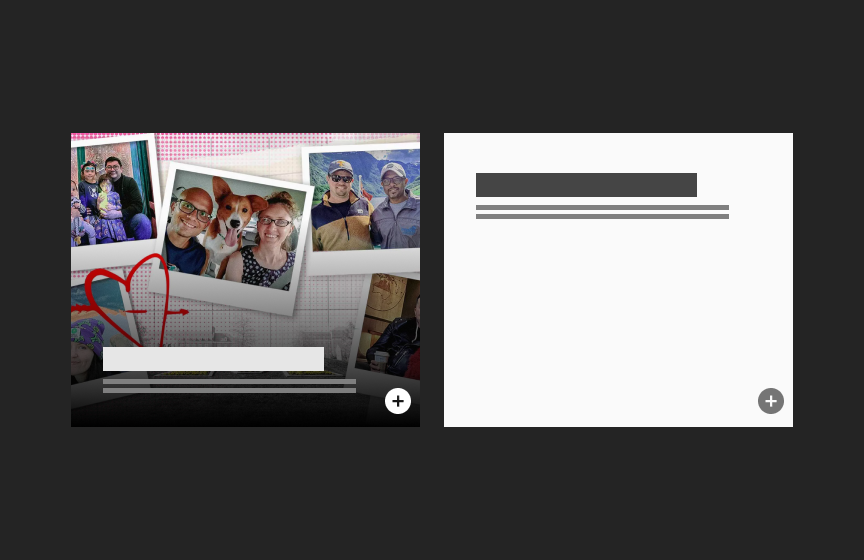
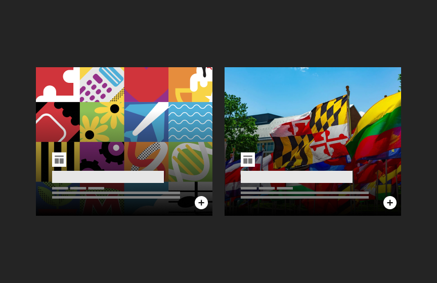
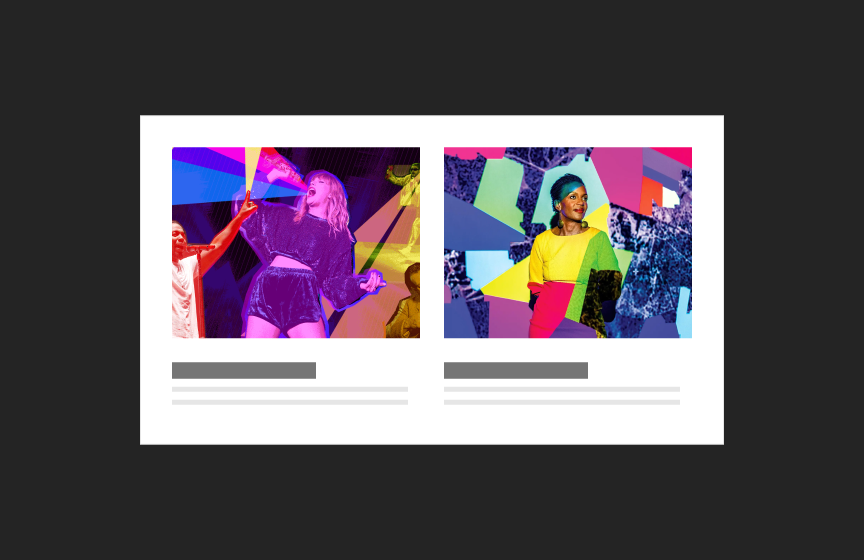
Overlay Card
Overlay Cards are used in groups and often lead to more content. They may be used to tease and link to editorial content (such as articles) or different sections of a website.

Dos
Use as a featured card in combination with Standard Cards or List components
Use for content that needs stronger visual emphasis or when stronger visual elements are needed on a page
Don'ts
Avoid using images with text
Don’t use with low-resolution or low-quality visuals
Don’t make titles or text too long or they will cover up the image
If using without images, do not mix dark and light themed versions
Avoid very light images, especially with whites at the bottom of cards where text will lay.
Variations
Accessibility
Keyboard Accessible
Users are able to use the keyboard to navigate through focusable content including a linked image, headline with a link, and call to action link, using the ‘Tab’ key to navigate/focus and ‘Enter’ or ‘Spacebar’ to activate.WCAG 2.1.1: Keyboard This navigation is done in sequential and logical order. WCAG 2.4.3: Focus Order
Hover and Focus State
A linked image, headline with a link, and call to action link each have their own distinctive styling on hover/focus to provide a visual cue to the user that the element is focused and there is an action that can be taken. WCAG 1.4.13: Content on hover or focus
Color Contrast
A contrast ratio of at least 4:5:1 between text and background color is ensured to enhance readability WCAG 1.4.3: Contrast (minimum)
Responsive
The component scales in relation to the to the screen size to prevent truncating content and reflows properly when zoomed up to 200% without horizontal scrolling WCAG 1.4.10: Reflow
Consistent
Styles are applied to the card consistently including line height, font style, weight, spacing and color of text. The heights of cards are maintained consistently when cards are grouped together in a row. This provides balance and allows for greater readability. WCAG 1.4.12: Text Spacing
Animated GIF for the Card Image
A pause button is added for users when an animated GIF is used for the card’s image. WCAG 2.2.2: Pause, Stop, Hide
Call to Action Icons
The icon call to action link can be focused and activated via keyboard using the ‘Tab’ key for focus and either the ‘Enter’ or ‘Spacebar’ key to activate. WCAG 2.1.1: Keyboard It is positioned logically in the tabbing order, following any preceding focusable elements. WCAG 2.4.3: Focus Order
- The icon link has distinctive styling for both hover and focus state to provide a clear visual cue that it is active. The icon link will display an outline and background change on focus WCAG 1.4.13: Content on hover or focus Color contrast ratio is maintained between icon and background to maximize readability. WCAG 1.4.3: Contrast (minimum)
Image
Provide effective alt text of the image that is concise and relevant. Avoid phrases like “image of” since screen readers often already announce the type of element. WCAG 1.1: Text Alternatives
- Do not use an image to present text. True text should be used whenever possible, as it supports translation, is searchable, and is easier to maintain and customize. WCAG 1.4.5: Images of Text
Title
Use a clear and concise title that describes the card content WCAG 2.4.6: Headings and Labels
Body Text
Write body text in clear and simple language. WCAG: 3.1.5: Reading Level Use descriptive link text for inline-links. WCAG 2.4.4: Link Purpose (In Context)
Link
Use effective text to describe what the link is and where it is taking the user. This should be clear, descriptive text that conveys the link content succinctly and the purpose and destination of the link. WCAG 2.4.9: Link Purpose (Link Only)
- Example of effective text (preferred): Learn more about Innovate Maryland
- Example of generic text (avoid): Learn more
Disclaimer: If the visible link text is not sufficiently descriptive, you can use an aria-label attribute to provide additional context for screen reader users. The aria-label should clearly describe the link's purpose and destination.
- If the visible text is not necessary for screen readers (e.g., it's redundant or less descriptive), consider using aria-hidden="true" on the visible text element. This ensures that screen readers will prioritize the aria-label.
Example with aria-label and aria-hidden:
<a href="https://example.com/innovate-maryland" aria-label="Learn more about Innovate Maryland"> <span aria-hidden="true">Learn more</span> </a>
This ensures that the link is accessible while maintaining concise visible text.
GIF
If you are using a GIF, ensure that it does not flash more than 3 times per second. Avoid large, flashing images that are bright with significant contrast between flashes. WCAG 2.3: Seizures and Physical Reactions
Content
Recommended image ratios
Horizontal
5:4
Vertical
3:5
Recommended Character Limits
The following recommendations are based on a 500px width. Character limits may be more or less based on the card’s width. Character limits are enforced.
Title
40 characters (80 max)
Text Block
120 characters (240 max)
Tagline/Overline
15 characters (30 max)
Quote (text)
100 characters (180 max)
Layout
Guidelines
- Helper icons should be used in Calls to Action to indicate a non-standard action such as downloading a document or going to an off-site URL
- Titles should link to the same URL as the Call to Action link if there is one
- Image aspect ratios will be enforced (card should display as squarish no matter what kind of photo is uploaded)
- Gradient behind text extends depending on height of text
Animation
- Hover state: Titles are underlined. Image gradient fades from 100% to 60% (lightens).
- Cards may take animated gifs as an option for images/graphics on cards. A pause button should show and function on an animated gif. Note: GIF option is not supported in feeds.


