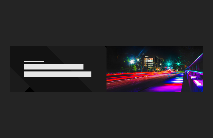
Minimal Hero
The Minimal Hero is a simple hero for interior pages where the focus should be on text or content lower on the page.
Dos
Use for a simple hero (with or without image)
Use on interior text-heavy pages
Don'ts
Don’t use on home or landing pages
Variations
Accessibility
Keyboard Accessible
Users are able to use the keyboard to navigate through focusable content using the ‘Tab’ key to navigate/focus and ‘Enter’ or ‘Spacebar’ to activate. WCAG 2.1.1: Keyboard This navigation is done in sequential and logical order. WCAG 2.4.3: Focus Order
Hover and Focus State:
The actionable items each have distinctive styling on hover/focus to provide a visual cue to the user that the element is focused and there is an action that can be taken. WCAG 1.4.13: Content on hover or focus
Color Contrast
A contrast ratio of at least 4:5:1 between text and background color is ensured to enhance readability. WCAG 1.4.3: Contrast (minimum)
Responsive Design
The component scales in relation to the to the screen size to prevent truncating content and reflows properly when zoomed up to 200% without horizontal scrolling WCAG 1.4.10: Reflow
Consistent
Styles are applied consistently including line height, font style, weight, spacing and color of text. WCAG 1.4.12: Text Spacing
Image
Provide effective alt text of the image that is concise and relevant. Avoid phrases like “image of” since screen readers often already announce the type of element. WCAG 1.1: Text Alternatives
- Do not use an image to present text. True text should be used whenever possible, as it supports translation, is searchable, and is easier to maintain and customize. WCAG 1.4.5: Images of Text
Title
Use a clear and concise title that describes the pathway content WCAG 2.4.6: Headings and Labels
Link
Use effective text to describe what the link is and where it is taking the user. This should be clear, descriptive text that conveys the link content succinctly and the purpose and destination of the link. WCAG 2.4.9: Link Purpose (Link Only)
- Example of effective text (preferred): Learn more about Innovate Maryland
- Example of generic text (avoid): Learn more
Disclaimer: If the visible link text is not sufficiently descriptive, you can use an aria-label attribute to provide additional context for screen reader users. The aria-label should clearly describe the link's purpose and destination.
- If the visible text is not necessary for screen readers (e.g., it's redundant or less descriptive), consider using aria-hidden="true" on the visible text element. This ensures that screen readers will prioritize the aria-label.
Example with aria-label and aria-hidden:
<a href="https://example.com/innovate-maryland" aria-label="Learn more about Innovate Maryland"> <span aria-hidden="true">Learn more</span> </a>
This ensures that the link is accessible while maintaining concise visible text.
Content
Recommended character limits
Title*
40 characters (80 max)
Tagline
30 characters (60 max)
*Dynamic Sizing. Font size adjusts down when over 40 characters are used
Recommended image dimensions
Optional image
1000px x 300px
Layout
The Minimal Hero is offered with dark and light background options. The style chosen should match what is chosen for the home page hero.
Animation
The hero should support animated GIFs as an option for images or graphics. A pause button should be displayed and functional when an animated GIF is used.
Guidelines
- Image aspect ratio is enforced
- Background pattern (if used) and image (if used) expand vertically if text wraps