Tabs
Similar to Accordions, Tabs group related content in a condensed space. They allow users to alternate between different views and information within the same area.

Dos
Use 2 or more tabs at a time
Use with succinct, related content. For extensive amounts of content, consider breaking out information onto a separate page.
Don'ts
Don’t use if a user will have to reference content in separate tabs at the same time
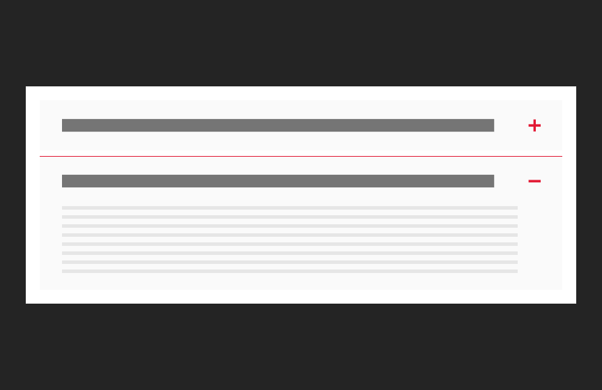
Variations
Accessibility
Keyboard Accessible
Users are able to use the keyboard to navigate through focusable content using the ‘Tab’ key to navigate/focus and ‘Enter’ or ‘Spacebar’ to activate.WCAG 2.1.1: Keyboard This navigation is done in sequential and logical order. WCAG 2.4.3: Focus Order
Hover and Focus State
Actionable items each have distinctive styling on hover/focus to provide a visual cue to the user that the element is focused and there is an action that can be taken. WCAG 1.4.13: Content on hover or focus
Color Contrast
A contrast ratio of at least 4:5:1 between text and background color is ensured to enhance readability. WCAG 1.4.3: Contrast (minimum)
Responsive
The component scales in relation to the to the screen size to prevent truncating content and reflows properly when zoomed up to 200% without horizontal scrolling WCAG 1.4.10: Reflow
Consistent
Styles are applied to the component consistently including line height, font style, weight, spacing and color of text. WCAG 1.4.12: Text Spacing
Title
Because the title of each tab serves effectively as the label for the tab content, this title should clearly describe the content that will be revealed when the tab content is selected. By doing so, the title acts as an accessible name WCAG 4.1.2: Name, Role Value which is announced by screen readers, helping users understand the function of the selection of the tab and the nature of the content it controls. The title should be concise yet descriptive enough to guide users through navigation and interaction. WCAG 2.4.6: Headings and Labels
Body Text
Write body text in clear and simple language. WCAG: 3.1.5: Reading Level Use descriptive link text for inline-links. WCAG 2.4.4: Link Purpose (In Context)
Link
Use effective text to describe what the link is and where it is taking the user. This should be clear, descriptive text that conveys the link content succinctly and the purpose and destination of the link. WCAG 2.4.9: Link Purpose (Link Only)
- Example of effective text (preferred): View full profile of Michael John Smith
- Example of generic text (avoid): View more
Disclaimer: If the visible link text is not sufficiently descriptive, you can use an aria-label attribute to provide additional context for screen reader users. The aria-label should clearly describe the link's purpose and destination.
- If the visible text is not necessary for screen readers (e.g., it's redundant or less descriptive), consider using aria-hidden="true" on the visible text element. This ensures that screen readers will prioritize the aria-label.
Example with aria-label and aria-hidden:
<a href="https://example.com/innovate-maryland" aria-label="Learn more about Innovate Maryland"> <span aria-hidden="true">Learn more</span> </a>
This ensures that the link is accessible while maintaining concise visible text.
Content
Recommended character limits
Tab label
15 characters (25 max)