Layout
Layouts within the UMD Design System use a standardized grid and spacing system based on multiples of four. The grid provides an underlying structure to our designs.
Grid measurements
Two Columns .umd-layout-grid-gap-two
Sizing: max. 2 columns above 650px
Three Columns .umd-layout-grid-gap-three
Sizing: max. 3 columns above 1024px
Four Columns .umd-layout-grid-gap-four
Sizing: max. 4 columns above 1200px
Mobile grid & breakpoints
On mobile, the outer margin is 24px, but there are many components that go edge to edge.

These are common breakpoints in responsive design. Major layout transformations primarily occur at two critical thresholds: 768px (mobile-to-tablet transition) and 1024px (tablet-to-desktop transition).
XS (Mobile)
320-479px
S (Mobile)
480-767px
M (Tablet)
768-1023px
L (Desktop)
1024-1439px
XL (Wide Desktop)
1440px and above
Grid types & examples
Ideal page layouts will typically contain a mix of grid styles, although an index page may just contain a Grid Gap grid.
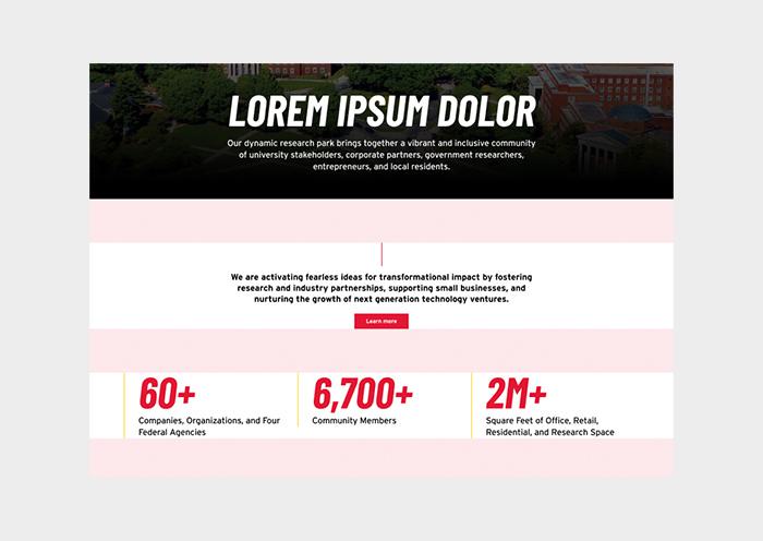
UMD Layout Grid Gap (Spaced Grid)
Full width: 2-4 cards per row. Uniform spacing
Interior width: 2-3 cards per row
Desktop 32-40
Tablet 32
Mobile 32
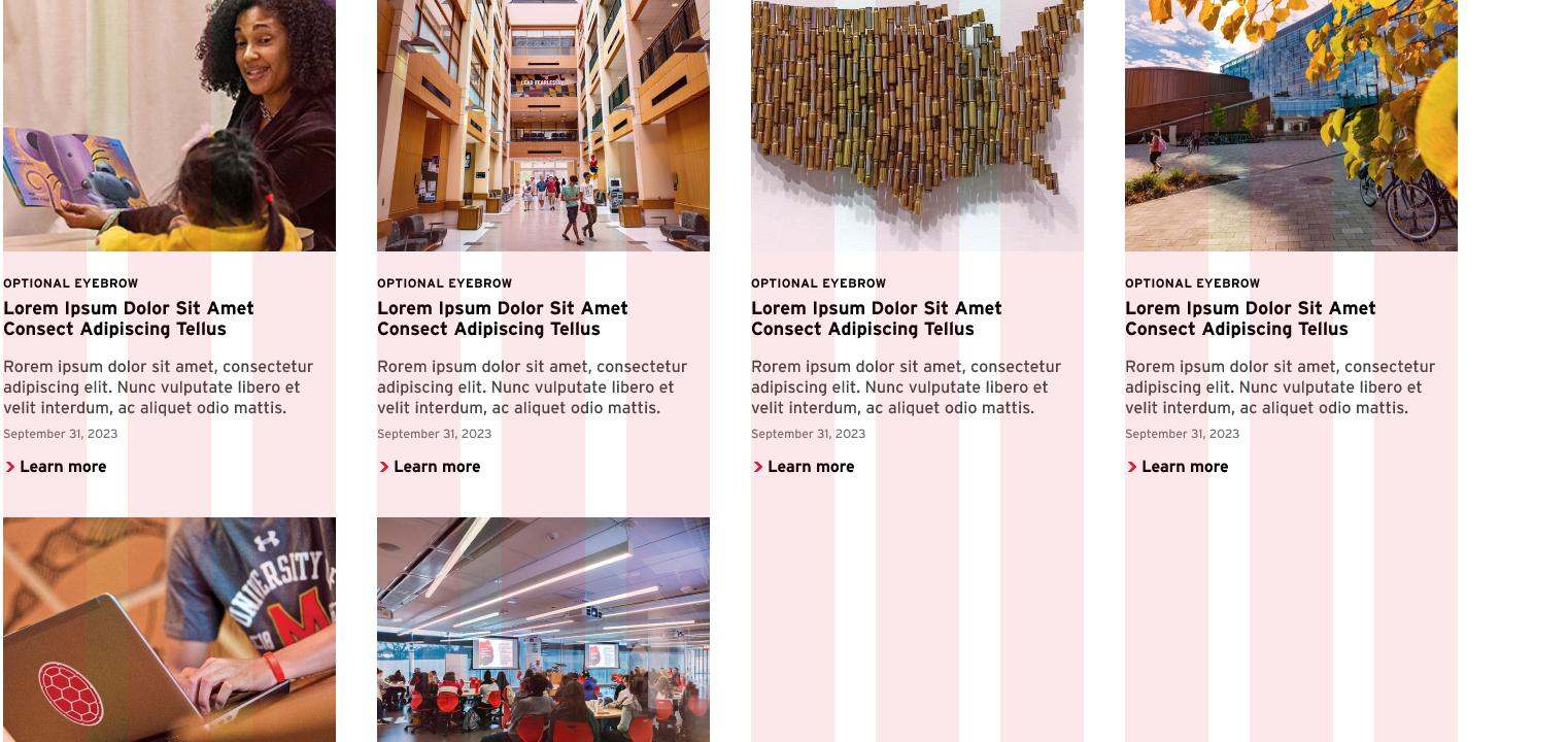
UMD Layout Grid (Gutterless)
Flexible layout, 2-4 cards take up equal width per row, or allow for a wide feature. Not used on interior pages
Desktop 0
Tablet 0
Mobile 8

UMD Layout Grid Gap Masonry (Staggered Grid)
Flexible layout, 2-3 cards take up equal width per row
2 cards alone use small lock. Not used on interior pages
Desktop 40
Tablet 32
Mobile 24
(normal stack)