UMDDesign System

Components

Components are the building blocks of any website. They structure content on pages, provide critical information, and encourage users to take action. 

The components below are grouped based on their intended purpose and content. Click on each component to see what it looks like, best practices for using it, and technical information for developers and designers.

To see example page layouts with components, visit the Templates section

Cards

Cards contain bits of information on a single topic. They can also encourage users to take a specific action, such as registering for an event, reading related content, or exploring pages deeper within a site.

Standard card: image, title and text, call to action

Standard Card

The most flexible card. Use in groups to lead to more content.

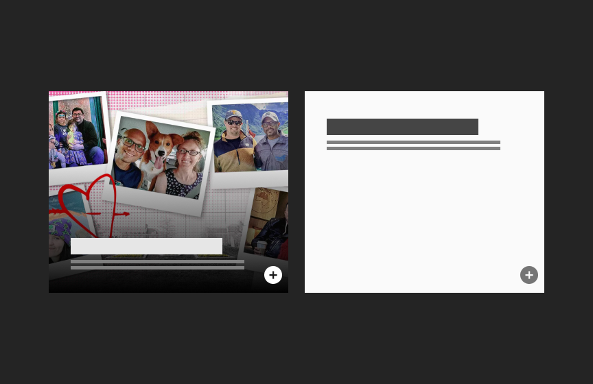
Overlay cards

Overlay Card

A visual card where text overlays the bottom of an image. Also available as a plain card with no image.

Icon Card Thumbnail

Icon Card

A simple card that uses an icon to represent an idea

List image

Standard List

A horizontal version of a card that can be used in groups to link to content

Thumbnail: image of the armory - columned front of building on the left; blocks representing title, text and button on the right

Standard Pathway

Showcases important content and can lead users to deeper pages in a site. An option featuring statistics is available

thumbnail - shows title, text blocks, and button on left side, blocks representing larger text on the right

Text Pathway

A visual option for text content that allows for highlighted text

Person cards

Person Card

Shows contact information for a single person. Use in multiples for a group of people.

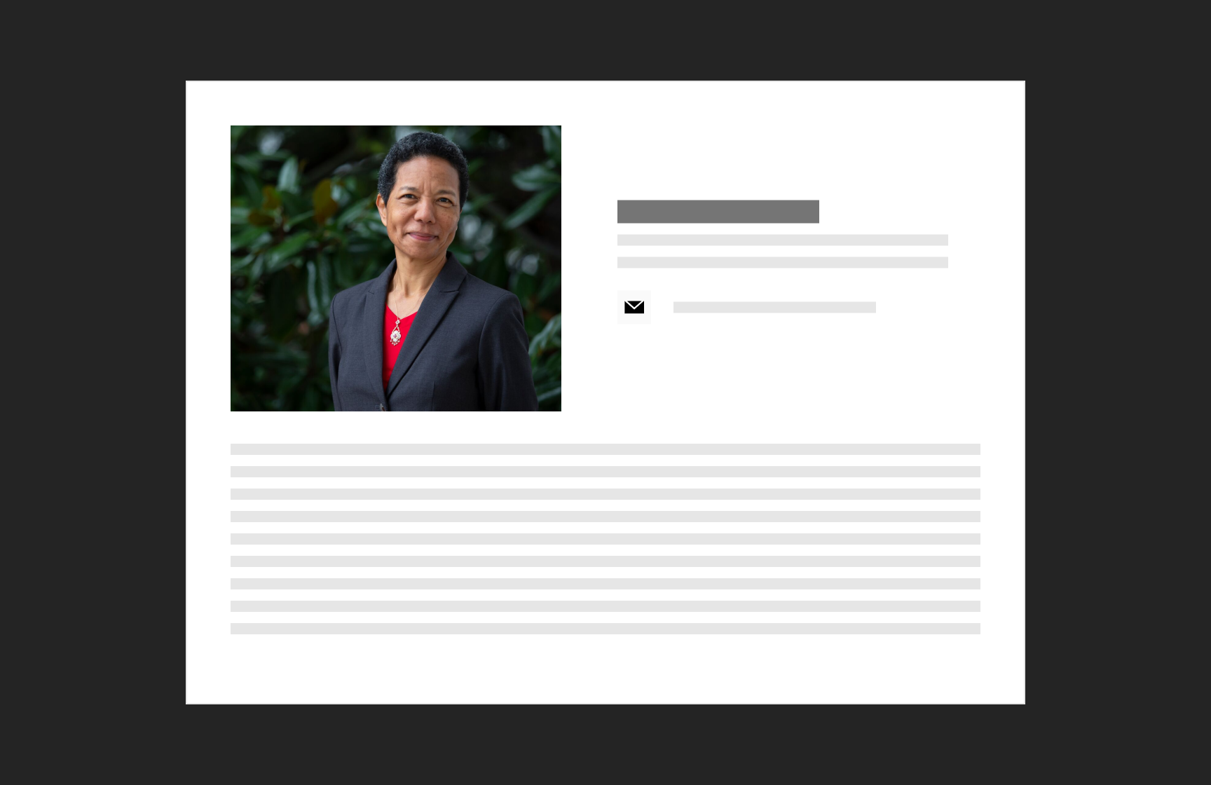
Thumbnail for bio card - shows an image of a woman on the left, blocks denoting name, title, contact information and multiple lines for bio text

Bio

Shows name, title, contact information, and additional short details

Thumbnail - photo of Iribe hall with yellow leaves on left, on right blocks depicting a title and text

Sticky Pathway

Image and text combination that allows for long text. Image sticks in place while a user scrolls through text.

Carousels

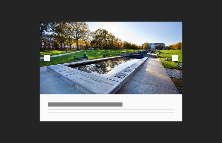
Standard Image

Standard Image Carousel

Displays 1 image at a time

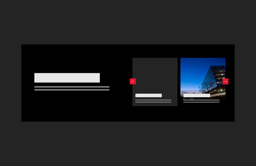
Greek text on left, 2 cards with carousel navigation. Left card is all text, right card is an image of ice cream in the background with greek text on top

Card Carousel

Shows 2 or more cards with additional information for context

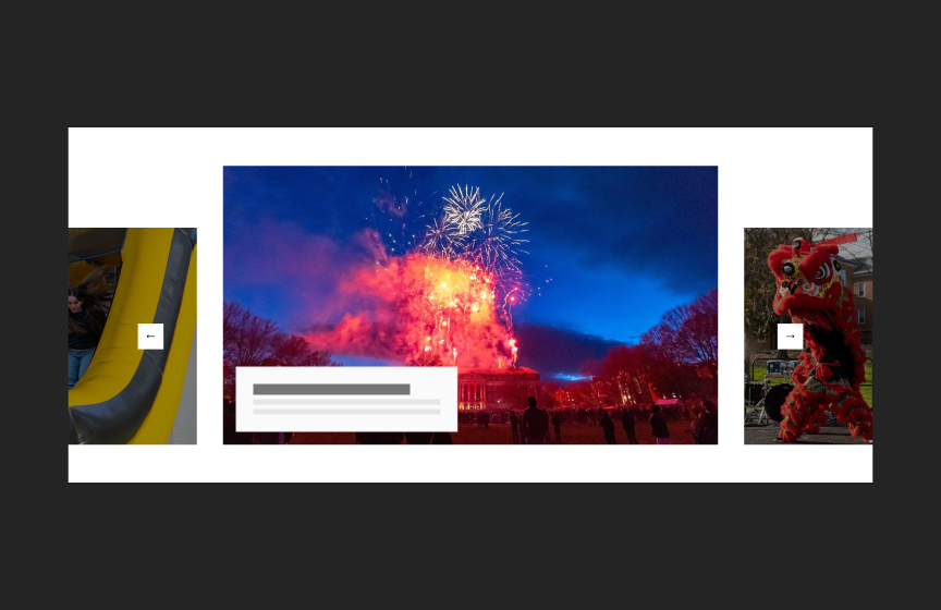
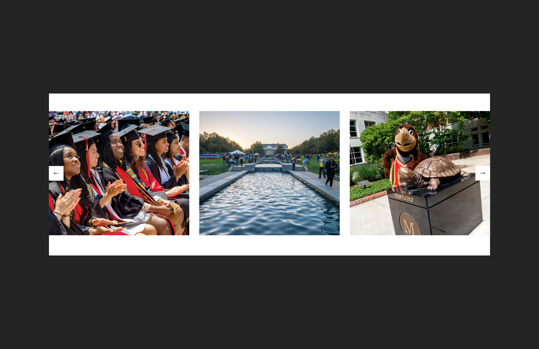
thumbnail showing 3 images (graduation, McKeldin Mall with people and fountain view, and Testudo mascot with Testudo statue

Multi Image Carousel

Displays multiple small images at once

4 people portraits in a carousel format

Thumbnail Carousel

A collection of 4 or more cards 

Events

Promote events and important dates to users in a variety of ways. 

Banner calendar

Date Slider

Use for important dates when only a few dates need to be shown. Use for date feeds

Feature image card

Event Card

Use in groups of 2 or more to show multiple events

Event cta

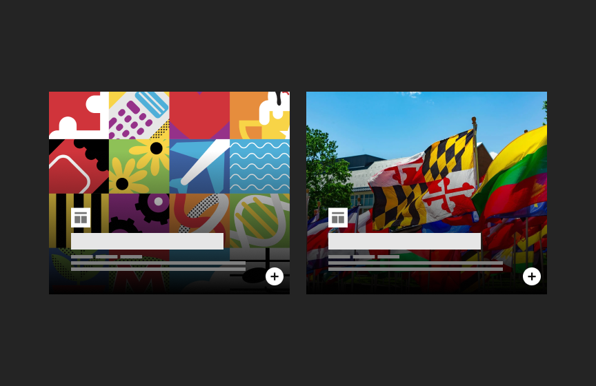
Event Overlay Card

Use in groups of 2 or more to show multiple events in a standard or staggered layout

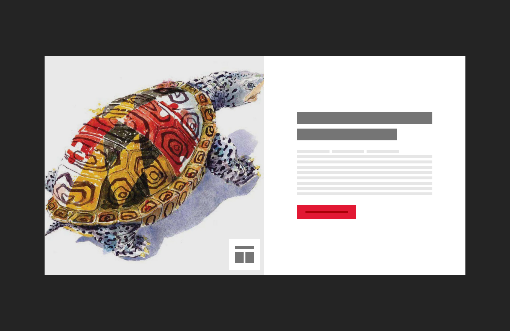
Thumbnail: Watercolor image of turtle with MD flag with block representing calendar date overlaid on left; On right blocks representing title, text and button

Event Pathway

Highlights a single event

Event listing

Event List

Shows multiple, equally-weighted events in a vertical list. Can be used with event feeds.

Text Highlight

Sometimes messaging needs to stand out - whether it’s on a single page or across an entire website. 
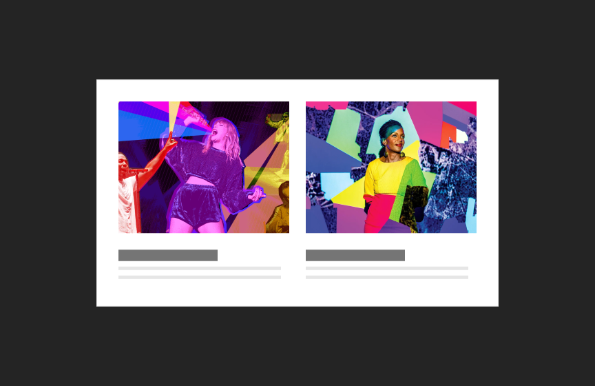
alert blueprint

Content Alert

Use for context-specific messaging on a page, such as reminders and announcements

alert graphic - yellow background with a title and text

Site Alert

An attention-grabbing notification that appears at the top of every page on a site

Banner promo

Banner Promo

Promotes important information with short text and a call to action

thumbnail - shows title, text blocks, and button on left side, blocks representing larger text on the right

Text Pathway

A visual option for text content that allows for highlighted text

Thumbnail - representing title on left and call to action on right

Section Intro - Wide

Use with full-width or left-aligned components

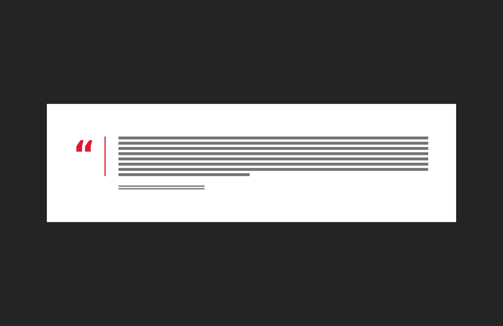
thumbnail - shows a quote icon and blocks to represent text and an attribution

Simple Quote

Highlights text and can break up space on a page

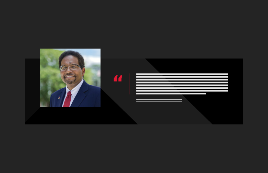
Featured Quote component thumbnail - red version of shows thumbnail photo and quote text

Feature Quote

A stylized, boxed-off quote option

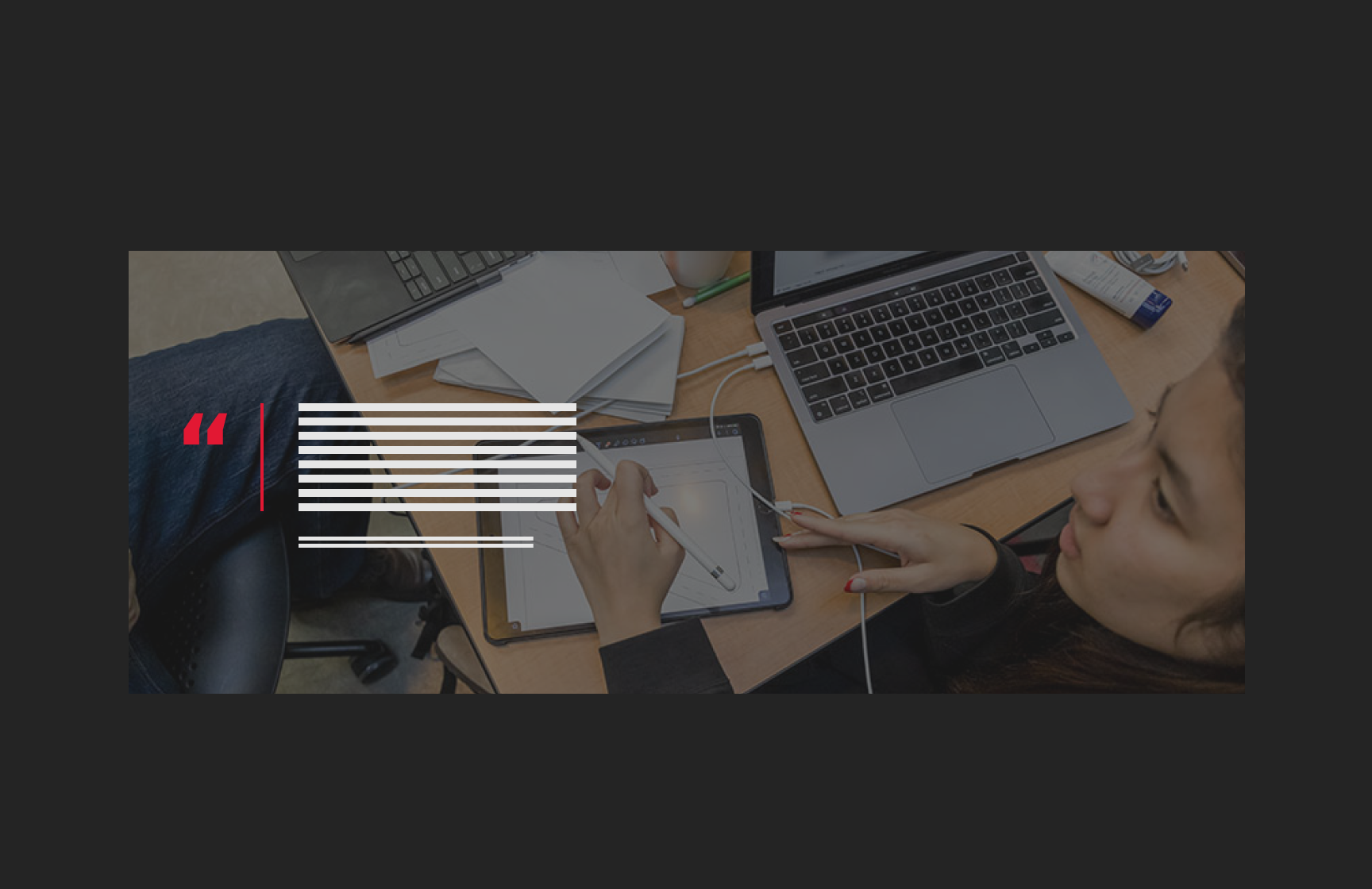
Thumbnail showing an image of a person at a laptop with a tablet, blocks representing a quote from a person on the left

Image Expand

A large display of an image that expands to show messaging as the user scrolls

Organized Content

When a page has large amounts of text, putting content into contained blocks helps users quickly move through information to find what they need. Chunking information also reduces clutter on a page. 
thumbnail - Accordion

Accordion

Groups sections of related content in blocks that can be opened and closed

Tab thumbnail

Tabs

Groups related content in a condensed space

Lines representing a title and text block next to cards with images

Sticky Columns

A 2-column layout option where one column "sticks" as a user scrolls down the page

Stats

Stats show statistics, rankings, or other numerical data. 

thumbnail of stat: large number, descriptive text, source text

Simple Statistics

Use in groups of 2 or more

what rectangle with "10th" and some lines to represent text

Statistics Cards

A large, visual way to show statistics