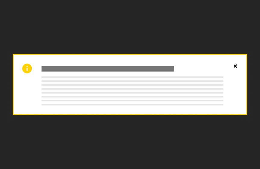
Site Alert
The Site Alert appears on every page of a site and should rarely be used. It highlights essential information that is relevant to most users visiting a site.

Dos
Use sparingly
Don'ts
Don’t use with long amounts of text
Variations
Accessibility
Keyboard Accessible
Users are able to use the keyboard to navigate through focusable content including headline with a link and call to action link, using the ‘Tab’ key to navigate/focus and ‘Enter’ or ‘Spacebar’ to activate, close the alert, and focus can be moved away from the component. WCAG 2.1.1: Keyboard; WCAG 2.1.2: No Keyboard Trap This navigation is done in sequential and logical order. WCAG 2.4.3: Focus Order
Hover and Focus State
A headline with a link and call to action link each have distinctive styling on hover/focus to provide a visual cue to the user that the element is focused and there is an action that can be taken. WCAG 1.4.13: Content on hover or focus
Color Contrast
A contrast ratio of at least 4:5:1 between text and background color is ensured to enhance readability WCAG 1.4.3: Contrast (minimum)
Responsive
The component scales in relation to the to the screen size to prevent truncating content and reflows properly when zoomed up to 200% without horizontal scrolling WCAG 1.4.10: Reflow
Title
Use a clear and concise title that describes the alert content. WCAG 2.4.6: Headings and Labels
Body Text
Write body text in clear and simple language. Avoid jargon, idioms, or complex language structures. WCAG: 3.1.5: Reading Level Use descriptive link text for any inline links within the alert. The link text should clearly indicate the destination or action. WCAG 2.4.4: Link Purpose (In Context)
Link
Use effective text to describe what the link is and where it is taking the user. This should be clear, descriptive text that conveys the link content succinctly and the purpose and destination of the link. WCAG 2.4.9: Link Purpose (Link Only)
- Example of effective text (preferred): Learn more about Innovate Maryland
- Example of generic text (avoid): Learn more
Disclaimer: If the visible link text is not sufficiently descriptive, you can use an aria-label attribute to provide additional context for screen reader users. The aria-label should clearly describe the link's purpose and destination.
- If the visible text is not necessary for screen readers (e.g., it's redundant or less descriptive), consider using aria-hidden="true" on the visible text element. This ensures that screen readers will prioritize the aria-label.
Example with aria-label and aria-hidden:
<a href="https://example.com/innovate-maryland" aria-label="Learn more about Innovate Maryland"> <span aria-hidden="true">Learn more</span> </a>
This ensures that the link is accessible while maintaining concise visible text.
Content
Recommended character limits
Title
60 characters (120 max)
Text Block
250 characters (500 max)
Layout
This component should be edge to edge on the site, with the inner content constrained by the appropriate site width.
Guidelines
This alert is collapsible and always appears between the hero and navigation.
Animation
When a user clicks the "×", the component fades offscreen and the rest of the content on the page slides up.

