Date Slider
The Date Slider shows a list of important dates that users can scroll through horizontally. It includes basic date information and can accommodate single-day and multi-day events.
Dos
Use when only basic date information is required
Use in combination with other components (Pathway Card, Rich Text) that require a series of dates to reduce page spacing
Don'ts
Don’t stack multiple Date Sliders together
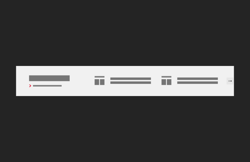
Variations
Accessibility
Keyboard Accessible
Users are able to use the keyboard to navigate through the actionable elements using the ‘Tab’ key to navigate/focus and ‘Enter’ or ‘Spacebar’ to activate and focus can be moved away from the component. WCAG 2.1.1: Keyboard; WCAG 2.1.2: No Keyboard Trap
Hover and Focus State
Each actionable element within the date slider (e.g., navigation arrows, call to action link, linked date titles) has distinct styling on hover and focus. This provides a visual cue to the user that the element is focused and an action can be taken. WCAG 1.4.13: Content on hover or focus
Color Contrast
A contrast ratio of at least 4:5:1 between text and background color is ensured to enhance readability. WCAG 1.4.3: Contrast (minimum)
Responsive
The date slider is responsive, adapting to various screen sizes to prevent content truncation and ensures proper reflow when zoomed up to 200% without horizontal scrolling WCAG 1.4.10: Reflow
Title
Use a clear and concise title that describes the date slider content WCAG 2.4.6: Headings and Labels
Link
Use effective text to describe what the link is and where it is taking the user. This should be clear, descriptive text that conveys the link content succinctly and the purpose and destination of the link. WCAG 2.4.9: Link Purpose (Link Only)
- Example of effective text (preferred): Learn more about Innovate Maryland
- Example of generic text (avoid): Learn more
Disclaimer: If the visible link text is not sufficiently descriptive, you can use an aria-label attribute to provide additional context for screen reader users. The aria-label should clearly describe the link's purpose and destination.
- If the visible text is not necessary for screen readers (e.g., it's redundant or less descriptive), consider using aria-hidden="true" on the visible text element. This ensures that screen readers will prioritize the aria-label.
Example with aria-label and aria-hidden:
<a href="https://example.com/innovate-maryland" aria-label="Learn more about Innovate Maryland"> <span aria-hidden="true">Learn more</span> </a>
This ensures that the link is accessible while maintaining concise visible text.
Content
Recommended character limits
Event Title
20 characters (50 max)
Component Title
15 characters (30 max)
Layout
The date strip includes a title, optional link, and up to 3 dates at a time. There are both light and dark versions. Use the light version when working within a lighter, airy design.
Guidelines
- Required title. Optional <view all> link and up to 3 dates.
- If fewer than 3 dates, dates remain left aligned
- Minimum 1 date. Maximum of 3 dates show at a time, with option to link to a full list or carousel option if more than 3 dates entered.
- Dynamic date listing - once date has passed, it should disappear from the component and the next date in sequence should appear
- Background color aligns to right of the site but content is constrained to the outer lock
- Accommodates date ranges. Show start and end dates in instance of a range.
- Sizing for height and width based on content - component height is based on event with the most characters (cost of having an aria-hidden attribute update for hidden elements)
Animation
- Hover state: Titles are underlined.
- Carousel function if more than 3 dates (desktop). Carousel function kicks in for fewer dates/cutoff as viewport shrinks. User should be able to swipe to advance dates as well as tap or click on arrows.
Related

Shows multiple, equally-weighted events in a vertical list. Can be used with event feeds.