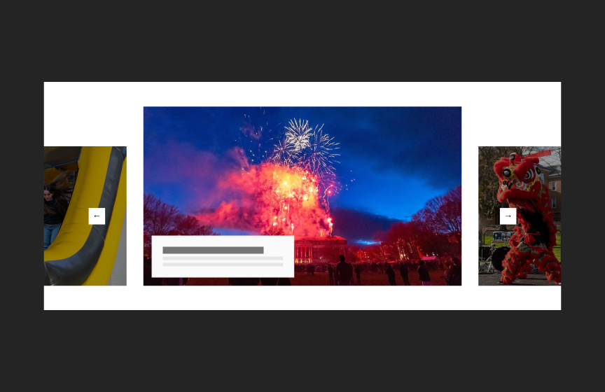
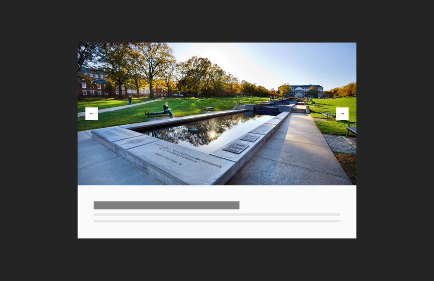
Standard Image Carousel
The Standard Image Carousel display one image at a time. It is optimized for use on interior pages.
Dos
Use on interior pages, articles, and detail pages
Use with appropriately sized images (don’t scale small images up)
Don'ts
Don’t use with more than 8 images
Don’t use long titles or text in the optional image captions
Variations
Accessibility
Keyboard Accessible
Users are able to use the keyboard to navigate through the actionable elements using the ‘Tab’ key to navigate/focus and ‘Enter’ or ‘Spacebar’ to activate and focus can be moved away from the component. WCAG 2.1.1: Keyboard; WCAG 2.1.2: No Keyboard Trap This navigation is done in sequential and logical order when there are multiple call to actions grouped together. WCAG 2.4.3: Focus Order
Hover and Focus State
Each actionable element within the carousel (e.g., navigation arrows, call to action links) has distinct styling on hover and focus. This provides a visual cue to the user that the element is focused and an action can be taken. WCAG 1.4.13: Content on hover or focus
Color Contrast
A contrast ratio of at least 4:5:1 between text and background color is ensured to enhance readability WCAG 1.4.3: Contrast (minimum)
Responsive
The component scales in relation to the to the screen size to prevent truncating content and reflows properly when zoomed up to 200% without horizontal scrolling WCAG 1.4.10: Reflow
Image
Provide effective alt text of the image that is concise and relevant. If the image is linked, the alt text should be succinct and descriptive of both the image and the linked content. Avoid phrases like “image of” since screen readers often already announce the type of element. WCAG 1.1: Text Alternatives
- Do not use an image to present text. True text should be used whenever possible, as it supports translation, is searchable, and is easier to maintain and customize. WCAG 1.4.5: Images of Text
Title
Use a clear and concise title that describes the card content WCAG 2.4.6: Headings and Labels
Body Text
Write body text in clear and simple language. WCAG: 3.1.5: Reading Level Use descriptive link text for inline-links. WCAG 2.4.4: Link Purpose (In Context)
Image Caption
Write caption text in clear and simple language. WCAG: 3.1.5: Reading Level
Content Recommendations
Recommended character limits
Title
90 characters (180 max)
Text Block
450 characters (900 max)
Layout
The carousel takes the width of the content well on interior pages. Maximum of 8 slides. Slide navigation adjusts the width responsively if needed. Caption is optional.
Guidelines
Don't set images to scroll through automatically.