Site Header
Includes a site’s logo and global navigation items. The hamburger menu at left houses the full menu with main and overflow links plus utilities such as search.

Dos
Limit main nav to a maximum of 5 links.
Use short, direct labels for nav links that signal what kind of information can be found on the page.
Be mindful of the number of pages within a section. Consider a different hierarchy if second-level sections are too large.
Don'ts
Don't use low-resolution logos. A scalable vector graphic (.svg) file is preferred.
Don’t add space around logo graphics (spacing is already built into the component).
Variations
Accessibility
Meaningful Sequence
Content in the header follows a logical reading order that makes sense when read by assistive technologies WCAG 1.3.2
Info and Relationships
The structure of the header (e.g., logo, navigation list) is conveyed through appropriate semantic HTML elements WCAG 1.3.1
Input Purpose
If there is a search input field, the purpose of the search field can be programmatically determined. WCAG 1.3.5
Orientation
The header is usable in both portrait and landscape orientations WCAG 1.3.4
Keyboard Accessible
Users are able to use the keyboard to navigate through the menu using the ‘Tab’ key to navigate/focus and ‘Enter’ or ‘Spacebar’ to activate.WCAG 2.1.1: Keyboard This navigation is done in sequential and logical order WCAG 2.4.3: Focus Order and focus can move away from the component as needed. WCAG 2.1.2: No Keyboard Trap
Hover and Focus State:
The actionable items each have distinctive styling on hover/focus to provide a visual cue to the user that the element is focused and there is an action that can be taken. WCAG 1.4.13: Content on hover or focus
Color Contrast
A contrast ratio of at least 4:5:1 between text and background color is ensured to enhance readability. WCAG 1.4.3: Contrast (minimum)
Responsive Design
The component scales in relation to the to the screen size to prevent truncating content and reflows properly when zoomed up to 200% without horizontal scrolling WCAG 1.4.10: Reflow
Consistent
Styles are applied consistently including line height, font style, weight, spacing and color of text. WCAG 1.4.12: Text Spacing
Logo
Provide effective alternative text for the site's logo. WCAG 1.1.1: Headings and Labels
Title
Use a clear and concise title that describes the pathway content WCAG 2.4.6: Headings and Labels
Content
*Images may be uploaded at larger sizes than indicated, but they will be constrained to the above proportions. SVG is the recommended file format.
Recommended character limits
Text Logo*
15 characters (25 max)
8 characters (16 max)
Call to action (button)
8 characters (10 max)
*If not uploading a logo
Layout
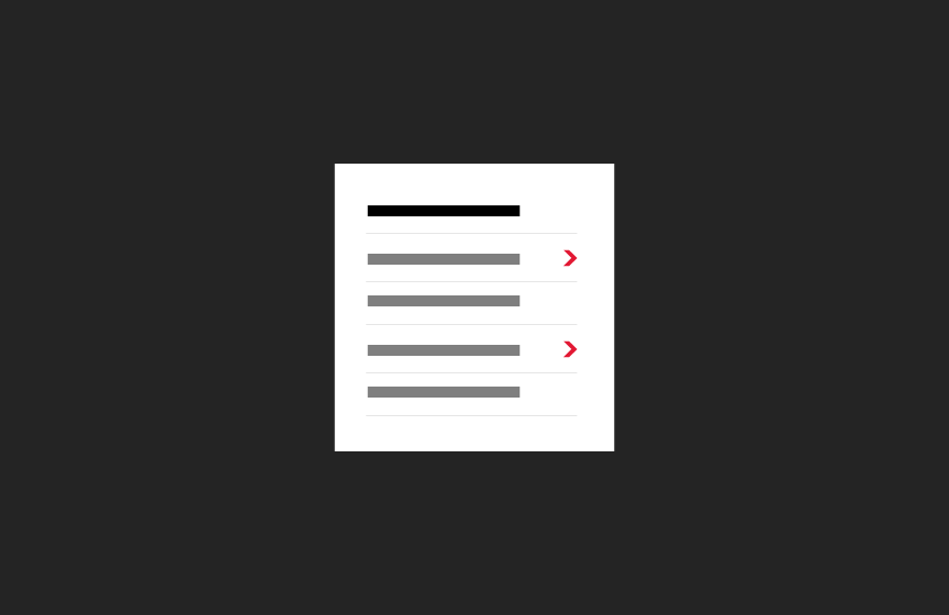
The site header is always on a white background under the universal header. Recommended to limit nav items to 5, with overflow going to the Full Menu.
Related


Contains main navigation links as well as additional (overflow) links. Functions as the site navigation on mobile devices.

Top-most UMD site header that contains global branding and may have additional navigation.