Layout Options for Cards
August 29, 2025
Knowing how to work with card types and layouts can be daunting in a system with so many options. Here you'll learn about the grid layout and other options to display groups of cards.
Cards being block elements, laying them out in some sort of grid makes a lot of sense. The UMD Design System makes use of many different types of grids.
Grid with Gap (Default Grid)
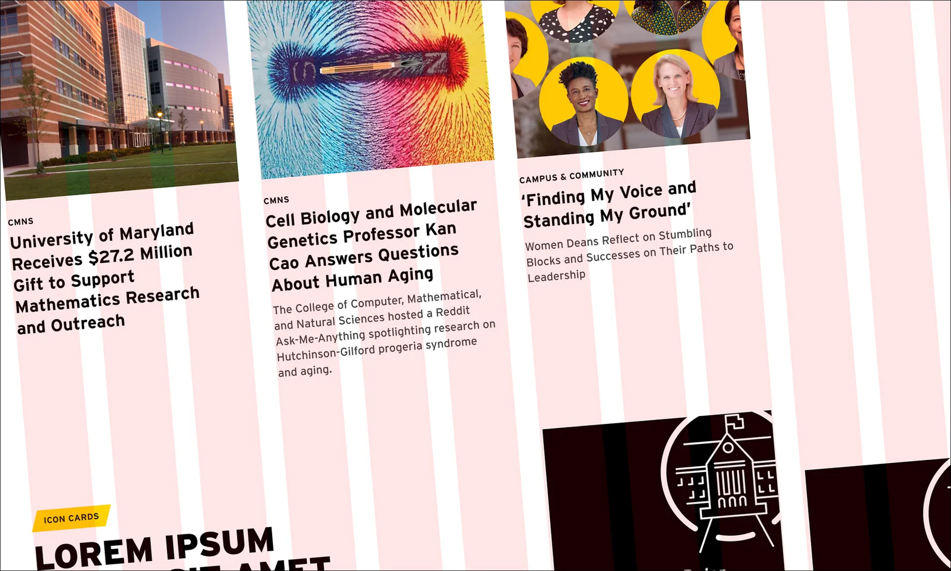
The most commonly used grid layout is a basic grid with a gap. In this layout, cards are laid out vertically aligned to the top, with a gap between 32 and 40 pixels. This is a very flexible layout and can be used in multiple rows. This layout can be used with any card type. For standard cards, depending on content width, content authors can change widths depending on content by adjusting the number of columns in the grid.
May be used with:
Standard Cards 3-column Example

Donec et urna vel risus feugiat pharetra. Proin id lacus vitae velit accumsan venenatis. Aenean non mi vel nisi lacinia maximus.
Nam tempor finibus lorem, nec varius arcu convallis

Morbi molestie arcu sit amet libero porttitor, a mollis odio suscipit. Fusce at sapien id justo cursus mollis. Ut non orci in magna pretium consequat. Nam id purus eu velit vulputate elementum. Mauris ac sapien non felis scelerisque tincidunt.
Sed at risus vel nulla consequat fermentum

Nullam elementum lorem vel facilisis laoreet. Cras ac turpis vel erat vehicula venenatis
Nullam nec turpis et arcu egestas commodo
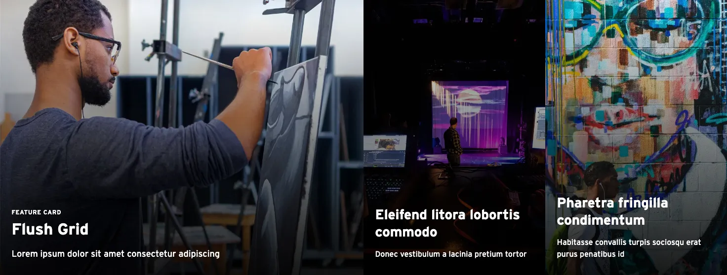
The above content is fairly long so may benefit from using a 2-up grid. Below, the images were also cropped to match or 'aligned'. Column number will have to be balanced with the number of cards needed also. On an interior layout, the grid will be narrower based on the allotted space.
Standard Cards 2-column Example
Donec et urna vel risus feugiat pharetra. Proin id lacus vitae velit accumsan venenatis. Aenean non mi vel nisi lacinia maximus.
Nam tempor finibus lorem, nec varius arcu convallis
Morbi molestie arcu sit amet libero porttitor, a mollis odio suscipit. Fusce at sapien id justo cursus mollis. Ut non orci in magna pretium consequat. Nam id purus eu velit vulputate elementum. Mauris ac sapien non felis scelerisque tincidunt.
Sed at risus vel nulla consequat fermentum
Nullam elementum lorem vel facilisis laoreet. Cras ac turpis vel erat vehicula venenatis
Nullam nec turpis et arcu egestas commodo
Gutterless Grid (Grid with No Gap)
A gutterless grid can only be used with Overlay Cards, including feeds that use Overlay Cards. It is not recommended to use this layout for when all cards in the row don't have images. Choose this layout type if looking for a solid visual block on a page, with quality images. For example, if you have a lot of components with a lot of whitespace above or below this component, like a plain Pathway or a grouping of standard cards, a block of overlay cards can provide a nice contrast.
The gutterless grid has a full, browser edge to edge option (Masonry) as well as a "contained" option where it doesn't extend past the default content width. We recommend that you don't use the edge to edge option near the top of a page, or near other components that have edge to edge content to optimize the contrast between components. The cards can also be set for multiple column widths should a feature card be necessary.
Staggered or Offset Grid
The Staggered layout is used to add variety to an otherwise boxy, strict grid layout. "Breaking the grid" can add interest to a design and call attention to content, because the layout is different from a typical grid structure, especially on the web.
When an element in a visual field distinguishes itself from others…it becomes a focal point and, therefore, assumes the greatest level of importance."
Timothy Samara
Making and Breaking the Grid
If using a staggered layout, it should be a pattern that repeats on a site so as to look intentional, whether it's on multiple pages, or on the same page. Overlay Pathways complement this layout and their use together can provide some cohesion. This layout can be used with:
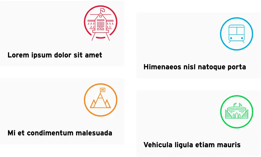
Example of Icon Cards in a staggered layout.
Carousels
Carousels are another way to display cards. A benefit of using a carousel is they take up less vertical space than a grid with multiple rows. A disadvantage is that some of the cards may be hidden, especially on a mobile device. You have to balance whether cards shown need an equal hierarchy, or if progressive disclosure is ok.
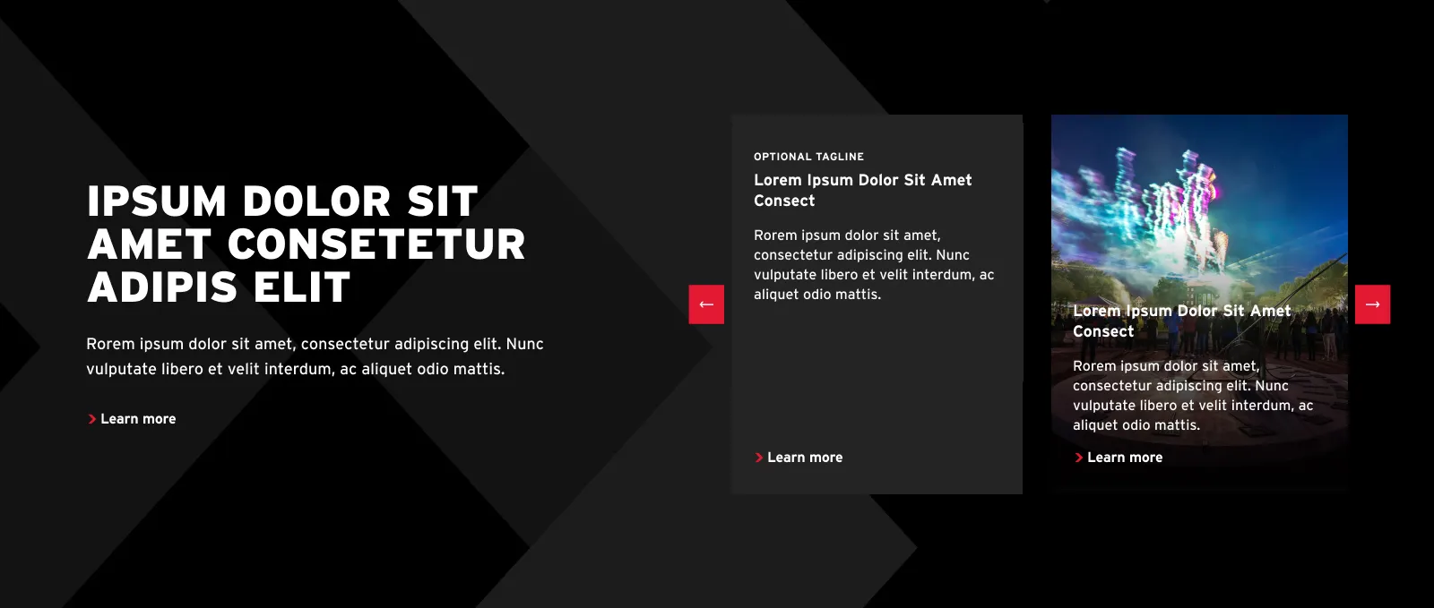
A card carousel is best used with an Overlay Card type.
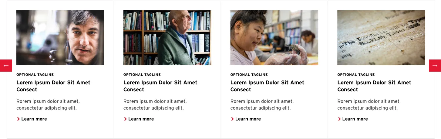
A Thumbnail Carousel is used with the Standard Card type.
Sticky Columns
Sticky Columns offers a way to display cards alongside a heading and text block to provide more context. They can be used with:
- Overlay Cards
- Icon Cards
- Standard Cards (Sticky Column can be a text block or a Featured Overlay Card)
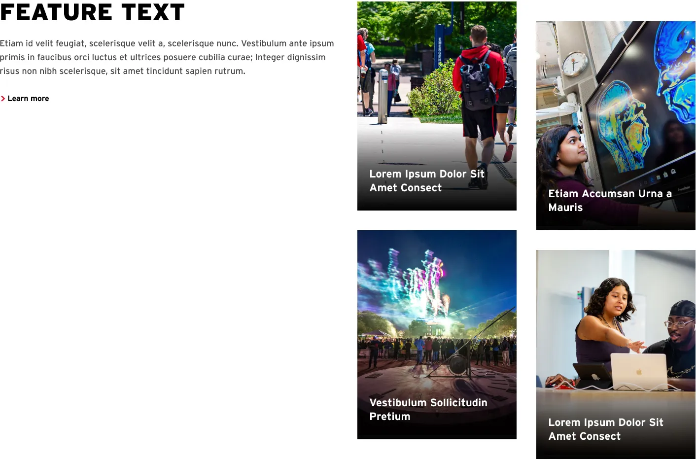
Sticky Columns with Overlay Cards.

Related
A deep dive into how and when to use cards, and all the layout options available for them.