All About Cards
August 20, 2025
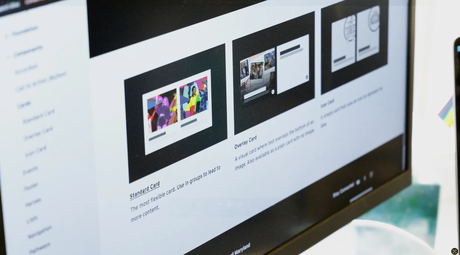
Cards are easily the most flexible and common components on any website. They are used to group information and typically lead to other pages. The UMD Design System offers many different card styles, with options to meet a multitude of content and layout needs.
Some content types have their own version of cards including Event and Person.
Standard Cards
Standard Cards are recommended if you have lengthier content, or imagery that is less visually compelling and more informational. Or, if you have imagery that can't have text overlaid on top of it. There is an article feed version of the standard card that pulls news articles from Maryland Today.
- Images are not required for Standard Cards but are strongly recommended, especially when images will be included with some cards in the same group.
- Standard Card images can be set to "aligned" which will enforce consistent sizing. The examples below are not aligned.
- Standard Cards may have a border

Nam id purus eu velit vulputate elementum. Mauris ac sapien non felis scelerisque tincidunt.

Integer laoreet, nisi a tincidunt tincidunt, odio nisl commodo libero, id.
Aliquam erat volutpat
Overlay Cards
Overlay Cards are flexible in that they can be used together with or without images. There is an article feed version of the overlay card that pulls news articles from Maryland Today. Overlay Cards may contain links, but links aren't required. Links may be a text call to action or an icon. The example below use an icon CTA.

Donec et urna vel risus feugiat pharetra
Nullam vehicula magna sit amet magna ullamcorper, at dictum est gravida. Morbi nec magna at quam malesuada accumsan.
Overlay Card with No Associated Image
Learn moreOverlay Cards can also be used to mix in quote content with other content. This example uses the dark theme Overlay Card with the full CTA option (right).

John Smith, Professor of Lorem Ipsum
Ex felis fermentum dui, eget pulvinar arcu eros eu eros. Vestibulum sollicitudin pretium velit
Nullam vehicula magna sit amet magna ullamcorper, at dictum est gravida. Morbi nec magna at quam malesuada accumsan. Suspendisse potenti. Vivamus feugiat massa ut tortor scelerisque, non dapibus nulla consectetur. Aliquam erat volutpat.
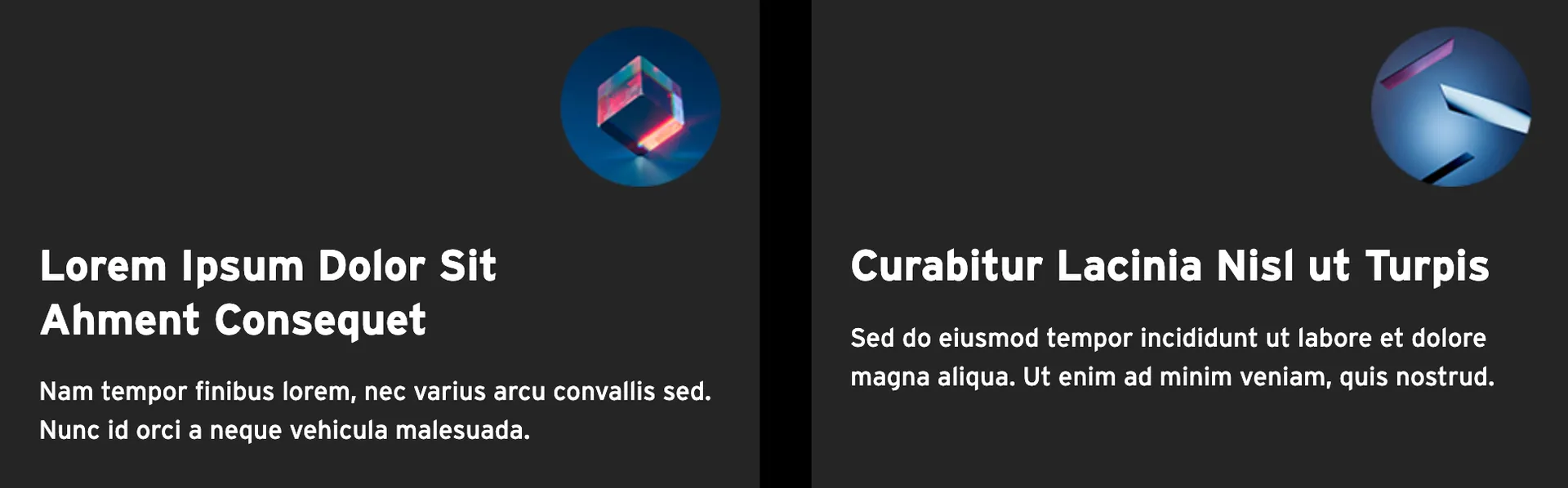
Icon Cards
Icon cards provide a card option that allows for use of an icon when a normal image won't work. Icon's may be uploaded in various formats and will always be placed in the upper right corner of the card. There are both light and dark theme options. Shapes are not enforced, so if a particular shape is desired, it must be uploaded in that format. Icons should be uploaded as svg or transparent pngs.
Below, an example of using icon cards with a dark theme and with art not typical of an icon style.
Not only are there a variety of card types, but there are a variety of layouts that can be used with these cards. Read about those next.

Learn about the grid layout and other options to display groups of cards.